Care Navigation
Problems
Objective
Create a consistent, scalable visual system for seven types of care: Home Remedies, Virtual Care, Primary Care, Express Care, Specialty Care, Urgent Care, and Emergency Care. Ensure icons are legible and recognizable at small sizes and across contexts. Build accessibility into the foundation of the system, testing for color contrast and color blindness. Establish the groundwork for integrating these icons across the Cleveland Clinic website and physical spaces.
The Problem
Cleveland Clinic serves a diverse population with varying health literacy levels, so helping patients identify where to seek care is critical. Patients often didn’t know what level of care was most appropriate for their condition. In several reports, the Cleveland Clinic has noted miscategorization of care level as a significant pain point in the patient journey. This leads to frustration, delayed treatment, and unnecessary costly ER visits. These miscategorized visits not only cost the patient, but they also impact the business model of the Cleveland Clinic.
The Access Care initiative set out to solve this by creating a simple, recognizable, and accessible visual system that guides patients to the right type of care. The challenge was twofold:
- Develop a set of icons and colors that are instantly understandable and work across a wide range of mediums.
- Ensure accessibility for all users, including those with color blindness or limited vision.
- Educate users and patients through consistent applications and experiences
My Role
I contributed to multiple phases of this project, wearing several hats throughout the process:
- Graphic Designer: Created and refined a cohesive icon set and color palette during the initial design storm, focusing on clarity, recognizability, and accessibility.
- Design Researcher: Led moderated studies to evaluate icon comprehension and accessibility. Designed and analyzed surveys that tested color and shape recognition.
- UX Designer: Currently contributing to the integration of the icon system into Cleveland Clinic’s digital experience by helping users connect their symptoms to the right type of care through consistent visual cues.
The Process
Icon Design
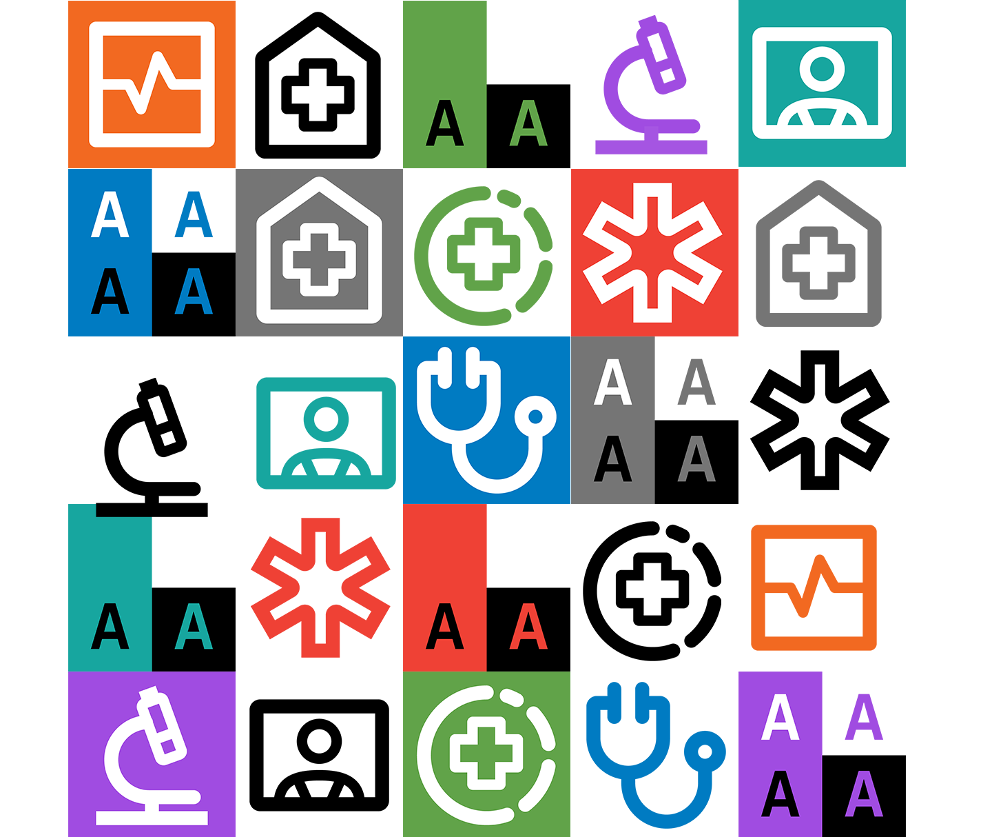
The project began with a design-storm—a collaborative competition between designers across the clinic to generate multiple icon system concepts. My submission focused on consistency and scalability, ensuring that each icon felt part of a unified family. The icon sets from other UX designers, graphic designers and illustrators across the clinic were then evaluated and a top three were selected by the leaders of the Digital Marketing department. My icon set was selected and then went on to the user research phase of the project.
User Research
As part of the next phase, I collaborated with the research team to evaluate the icon sets through surveys and moderated usability studies.
- Participants were asked to match icons to care levels, identify meanings at a glance, and provide feedback on color clarity.
- I conducted accessibility testing, including simulations for color blindness and small-scale visibility, to ensure inclusivity.

Insights
A key insight emerged: using multiple shades of blue and green in a single palette caused confusion. Participants mixed them up around 70% of the time. This insight was critical to refining our color system moving forward.
My set was praised for its coherence and visual consistency.
Solution & Implementation
Today, I’m continuing to support the Access Care initiative as part of the UX design team. I’m continuing to refine the icon set to bring greater consistency and accessibility to the system as it’s rolled out.
Before: the icon set selected from the user studies.
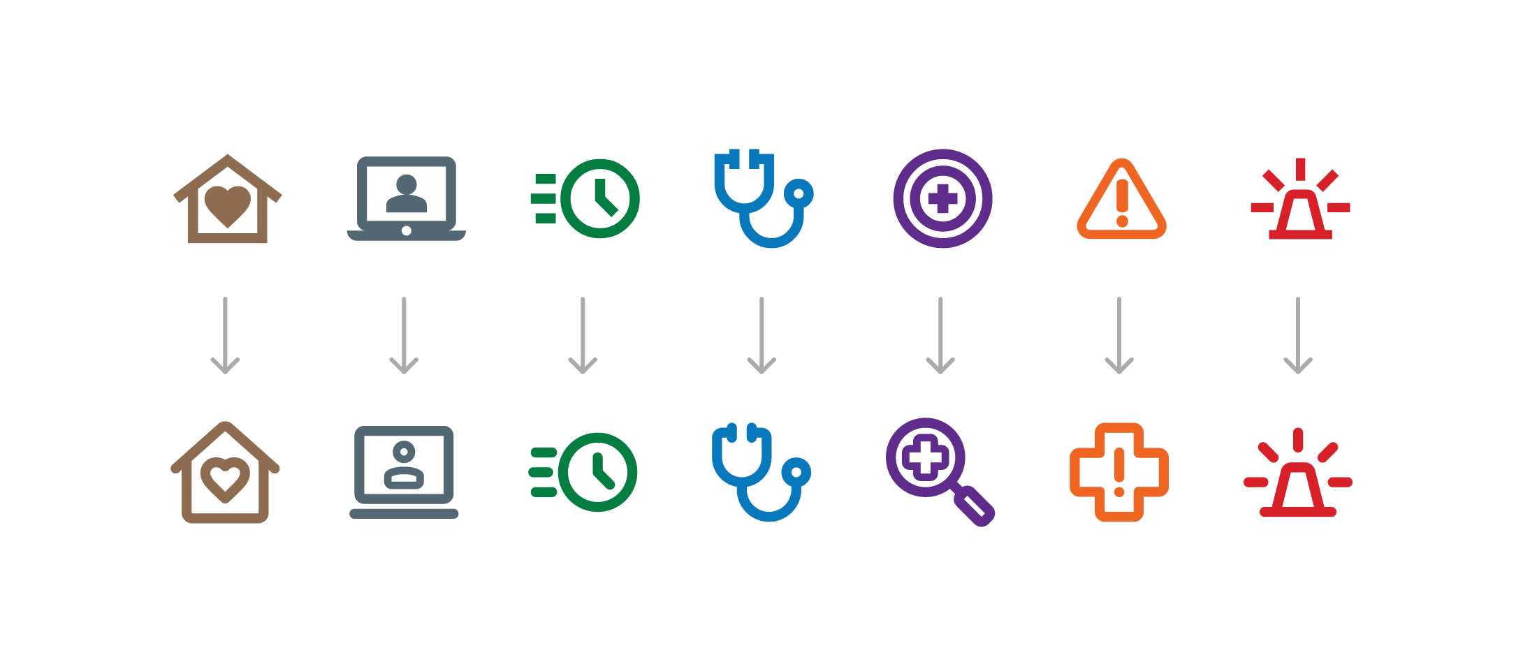
After: I personally refined and revised the selected set for consistency.
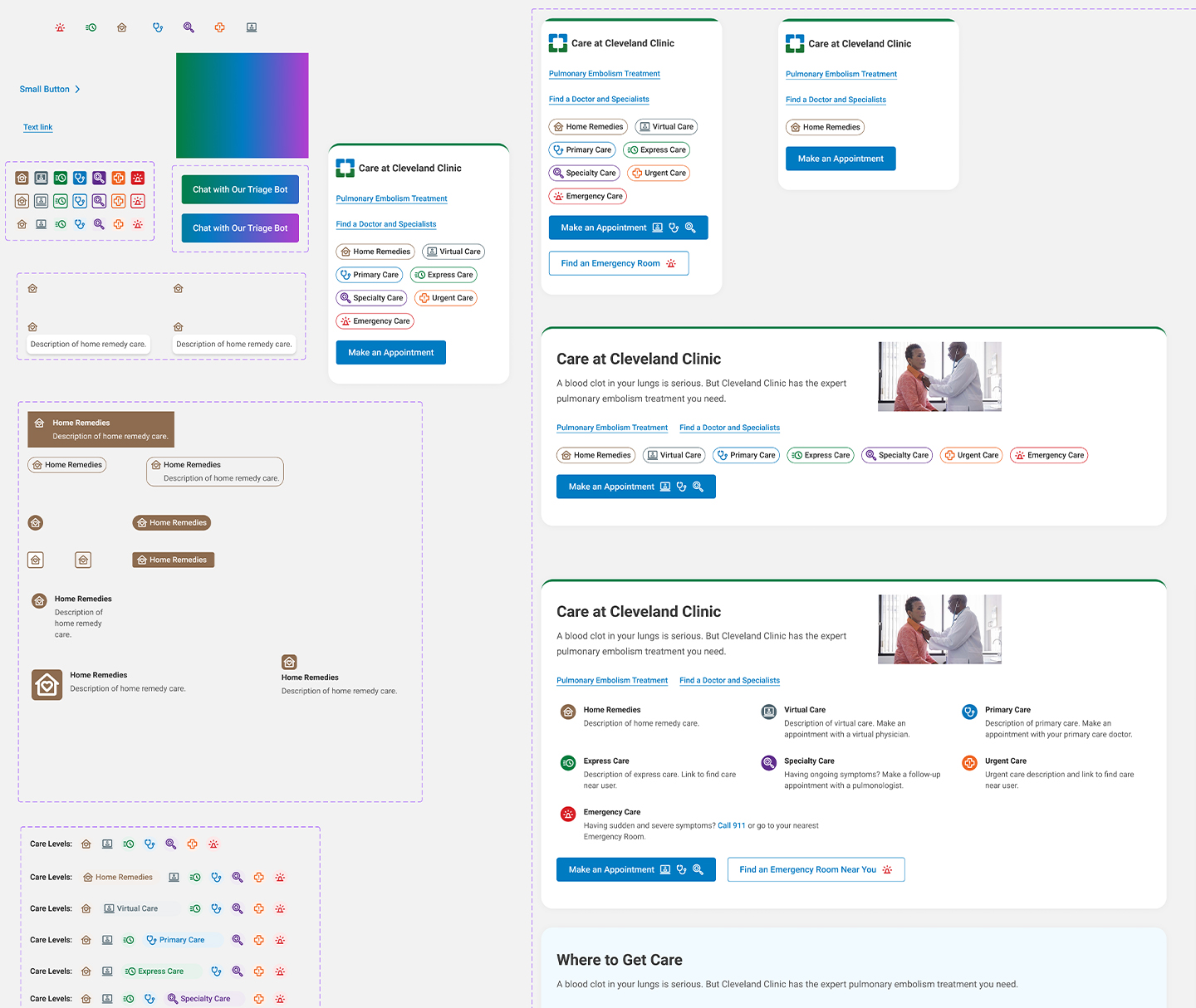
We’re now integrating the icons and color language across Cleveland Clinic’s digital ecosystem. For example, on symptom pages like Flu, users will see icons for relevant care types—Home Remedies, Virtual, Express, and Urgent Care—each paired with a description of when that option is appropriate.
This early implementation is intentionally simple but strategic: it introduces a consistent visual language that patients can begin to recognize across all points of their care journey, from the website to signage to printed materials.

Reflection
This project reinforced my belief that every pixel matters when designing for scale. Consistency and accessibility are essential for clarity and trust in healthcare experiences.
Even though my icon set wasn’t ultimately chosen, the process allowed me to demonstrate versatility across design and research roles and contribute meaningful insights that shaped the direction of the project.
As the initiative evolves, I’m continuing to help refine the system’s UX integration, ensuring that patients can confidently recognize where to go, no matter where they are in their care journey.